

How to Spot High Quality Island Prints in 7 Steps
Quick Summary
To spot high quality island prints, check print sharpness, color accuracy, fabric feel, and fade resistance before you buy. Look closely at fine edges and gradients, test the fabric by feel and stretch, and ask the seller about the ink type and how it is fixed to the fabric.
- Look for crisp petal edges and thin lines that stay separate at close range.
- Check gradients for banding, which signals a lower-quality print.
- Rub fabric between your fingers and pull it gently to test softness and stretch.
- Ask sellers for the ink type and fixation method, such as heat-set at a stated temperature.
- Do a damp-cloth test on a hidden seam: color transfer means the dye is not fully fixed.
Table of Contents
- Why Island Print Quality Varies So Much
- Step 1: Check Print Sharpness and Fine Detail
- Step 2: Judge Color Accuracy, Saturation and Tonal Range
- Step 3: Inspect the Fabric and How to Check Fabric Quality in Clothing
- Step 4: Test Whether a Clothing Print Will Fade
- Step 5: Confirm Culturally Respectful Island Fashion
- Step 6: Follow Island Print Clothing Care Instructions
- Red Flags That Signal a Low-Quality Island Print
- Frequently Asked Questions
Why Island Print Quality Varies So Much
Island prints are sold everywhere, from boutiques to big-box stores, and the quality gap between them can be huge. Some shirts hold their color for years.
This guide from Wake Up and Live walks you through seven checks you can do before you buy. You do not need special training. You only need good light, a bit of patience, and a clear idea of what to look for.
Print quality depends on three things: the printing method, the fabric underneath, and the ink. To understand the cost side, see why artisan-made clothing costs more than fast fashion. Cheap production often cuts corners on all three. The steps below show you how to spot those shortcuts.
A quick note on terms. A print is the design applied to fabric. The fabric is the material it sits on. Keep these two apart as you read, because a great print on weak fabric still disappoints.
Step 1: Check Print Sharpness and Fine Detail
Start with your eyes. Look closely at the smallest parts of the design, such as the edges of hibiscus petals, leaf veins, and thin border lines.
Sharp prints show clean, crisp edges. Low-quality prints look blurry, soft, or slightly doubled, especially on fine lines.
Use this quick checklist:
- Are petal edges clean, or do they look fuzzy?
- Do thin lines stay separate, or do they bleed together?
- Can you read tiny text or small motifs clearly?
Hold the garment at arm's length, then bring it close. A good print looks crisp at both distances.
Watch out: Online photos are often edited to look sharper than the real item.
Step 2: Judge Color Accuracy, Saturation and Tonal Range
Island prints rely on bright color. The goal is vivid color that still shows depth, not a flat, neon look.
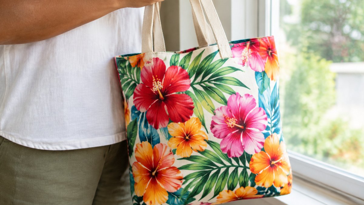
Check these points in daylight, not under store lights, which can distort color:
- Saturation: Colors should feel rich, not washed out or overly harsh.
- Tonal range: Look for light and dark shades within the same motif. A flower with only one flat shade of orange usually means fewer ink layers.
- Gradients: Smooth transitions should look smooth. Visible stripes or steps in a gradient, called banding, signal a lower-quality print.
Compare two prints side by side if you can. The better one usually looks more layered and balanced.
Step 3: Inspect the Fabric and How to Check Fabric Quality in Clothing
A beautiful print on thin, scratchy fabric will not last. Fabric quality decides how the print feels, how it wears, and how long it stays.
To check fabric quality in clothing, try these simple tests:
- Feel: Rub the fabric between your fingers. Soft, even texture is a good sign. Stiff or papery material is a warning.
- Stretch: Gently pull the fabric in two directions. It should spring back without thin spots appearing.
- Light test: Hold the fabric up to a light. If you can see through it easily where you do not want to, it may be too thin.
Natural fibers such as cotton and linen feel different from polyester blends. Check the label and decide what you prefer. Whatever the fiber, the fabric should feel comfortable against your skin.
Step 4: Test Whether a Clothing Print Will Fade
Fading is one of the biggest complaints about island prints. Bright colors can dull quickly if the ink is weak, poorly fixed, or exposed to the wrong conditions. The goal is not to prevent all fading, every print changes over time, but to tell slow, even aging apart from sudden color loss, and to verify the seller's longevity claims before you spend money.
Read the ink and fixation story, not just the care label
A care label tells you how to wash the garment (the FTC). It does not tell you whether the ink will survive the wash. Ask the seller two direct questions: what ink chemistry is used, and how it is fixed to the fabric.
- Pigment inks sit on top of the fibers and are usually heat-set or cured. They tend to resist fading and bleeding well, but on heavy cotton they can feel slightly raised. Ask whether the print was heat-set and at what temperature.
- Dye-based inks bond into the fibers and feel softer, but many dye sets are more vulnerable to UV light and repeated washing. Ask whether the dye is reactive or acid-based and whether a fixative was applied.
- Direct-to-garment (DTG) prints are common for detailed island artwork. Quality varies widely with pretreatment and curing; a properly pretreated and cured DTG print holds detail and color far better than an uncured one.
Clear, specific answers, "water-based pigment, heat-set at 320°F", are a better sign than "high-quality inks." Vague answers are a warning.
Verify archival and longevity claims
Many sellers use words like archival, fade-resistant, or colorfast without defining them. Ask for the material specification: ink brand or type, fabric composition, and any stated wash-fastness or lightfastness rating.
Watch out: a seller who cannot name the ink type or the fixation method is unlikely to stand behind a longevity claim, no matter how the product page is worded.
Do a gentle at-home test before the first full wash
- Damp-cloth test: Dab a damp white cloth on an inside seam or hidden corner of the print. Color transfer means the dye is not fully fixed and will likely bleed in the wash.
- Dry-rub test: Rub the print with a dry white cloth. Powder or color on the cloth signals loose pigment or poor curing.
- Sun check: Tape a small scrap of the same fabric in a sunny window for a week and compare it to a stored piece. Noticeable lightening in that window is a sign the print will fade quickly outdoors.
Know what normal fading looks like
A well-made pigment print typically softens only slightly and evenly over many washes, while a weak print can show patchy loss or color shifts within a few washes. Sudden loss of one color channel, often magenta or cyan, is a classic sign of a poorly fixed dye. If you see that after the first wash, the print was not made to last.
Island-specific fade risks
Coastal and humid environments accelerate fading. Salt air, high humidity, and strong UV exposure all stress prints faster than a dry inland climate. If you live near the coast, prioritize pigment inks, heat-set or properly cured prints, and garments you can air-dry in shade.
Fading is the main complaint about island prints, so these checks help you judge whether a print will last.
| Check | What to look for | Red flag |
|---|---|---|
| Damp-cloth test | No colour on a white cloth | Colour transfers to the cloth |
| Dry-rub test | No powder or colour on a white cloth | Powder or colour on the cloth |
| Sun check | No visible lightening after one week | Noticeable lightening in the window |
| Ink type | Named ink, e.g. water-based pigment | Vague claims like high-quality inks |
| Fixation | Heat-set at a stated temperature | No fixation method given |
| Coastal climate | Prioritise pigment inks and shade drying | Fast fading in humid, sunny settings |
Step 5: Confirm Culturally Respectful Island Fashion
Quality is about more than stitching and color. It also matters whether a design respects the culture it draws from.
Island patterns carry history and meaning. Many designs come from Polynesian, Samoan, Tongan, and other Pacific traditions. Respectful brands usually:
- Credit the cultural inspiration clearly
- Work with island designers or artisans where possible
- Explain what the motifs mean, rather than using them as random decoration
If you are unsure, read the brand's product descriptions and about page. Specific, honest details beat vague claims about "tropical vibes." Read more in our guide to where appreciation ends and appropriation begins.
Step 6: Follow Island Print Clothing Care Instructions
Even a high-quality print needs care to last, and island prints face conditions that inland garments do not: humidity, salt air, strong sun, and frequent washing after beach or boat use. Good care protects the color, the fabric, and the feel of the garment, and it is where most buyers accidentally shorten a print's life.
Washing
- Wash inside out in cool water to reduce friction on the print surface.
- Use a mild, pH-neutral detergent and skip bleach, fabric softener, and enzyme-heavy detergents, which can break down color and coatings.
- Turn the garment inside out and close zippers or buttons so hardware does not abrade the print.
- Wash separately for the first few cycles if the print is new, in case of residual dye bleed.
- Skip the dryer when you can. High heat is the fastest way to crack a pigment print and set wrinkles into the fabric.
Drying
- Air dry in the shade. Direct sun is the single biggest cause of fading in coastal climates, and a print that survives the wash can still bleach on the line.
- Dry flat or hang on a padded hanger for knits and heavy cotton so the garment does not stretch out of shape.
- Avoid drying on hot metal or dark surfaces that concentrate heat.
Ironing and storage
- Iron on the reverse side or use a pressing cloth, and never iron directly on the print. A low setting is safer than high heat.
- Store folded, away from strong sunlight and damp. In humid climates, store garments with a desiccant packet and avoid sealed plastic bags that trap moisture against the fabric.
- Rotate what you wear so no single print takes all the sun and washing.
Humid and coastal conditions
Humidity and salt air are the quiet enemies of island prints. Salt residue can stiffen fabric and dull color, and persistent damp encourages mildew in natural fibers.
Watch out: storing a damp print in a sealed bag or a hot car is one of the fastest ways to set mildew and color shift, dry it completely first, even if that means leaving it in shade for a full day.
Framed and displayed prints
If you are caring for a framed island print rather than a garment, the same logic applies. Hang it out of direct sun, keep it off humid exterior walls, and use UV-filtering glazing where possible. In coastal homes, avoid hanging prints in bathrooms or above kitchen stoves, where steam and salt air do the most damage. Check the frame backing periodically for damp or foxing, and reframe with acid-free materials if you see staining.
A simple care routine that works
A practical routine is: wash cool and inside out with mild detergent, air dry in shade, iron on the reverse only when needed, and store dry and folded away from sun and damp.
Red Flags That Signal a Low-Quality Island Print
Some warning signs show up again and again in poorly made prints. Watch for these before you buy:
- Blurry edges or doubled lines in the design
- Colors that look neon or washed out, with no tonal depth
- Visible banding in gradients
If you spot two or more of these, look for another option. Trust your instincts. A print should feel as good as it looks.
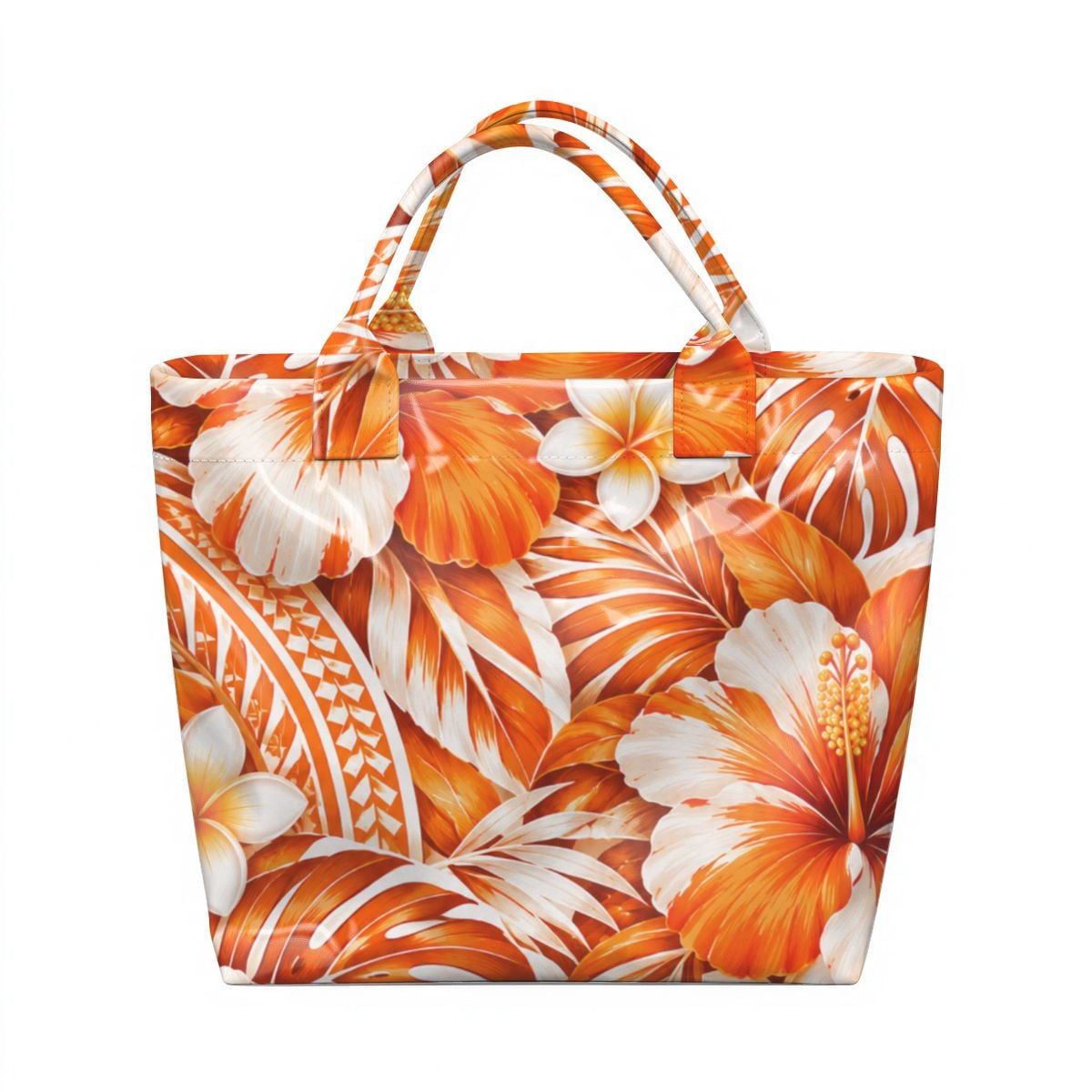
Once you know what quality looks like, shopping gets easier. Explore our collection to see how these standards show up in real designs, starting with the Island Sunset Floral Tote Bag, which shows crisp hibiscus detail and vivid orange tones.
Frequently Asked Questions
How can you tell if an island print is high quality?
Look at sharpness first. Hold the fabric about 12 inches from your eyes and check whether the hibiscus petals and leaf veins have crisp edges rather than soft, blurred outlines. Next, check color: a well-made print shows even saturation with no faded patches, and the tonal range should move smoothly from light to dark areas without harsh banding. Finally, inspect the back of the fabric. Good prints show the color clearly on both sides or a clean, consistent reverse, which suggests the dye penetrated the fibers rather than sitting on the surface.
How can I tell if a clothing print will fade?
Start by asking the seller whether the print is dye-based or pigment-based and whether they have tested colorfastness. Then do a simple check at home: dampen a hidden seam with water and press a white cloth against it. If color transfers, the print will likely bleed or fade in the wash. Always wash inside out in cold water to help protect any print.
How should I wash island-print clothing to preserve its color?
Wash island-print clothing inside out in cold water with a mild detergent, and avoid bleach or chlorine-based products. Skip the dryer when you can, because heat is the fastest way to fade bright hibiscus and tropical colors. Hang items to air dry out of direct sunlight, since prolonged UV exposure also dulls printed fabric. For bags with laminated interiors, empty the bag first, pretreat visible stains, spot clean with warm water and a soft cloth, and allow it to air dry completely before storing.
What makes an island-inspired design culturally respectful?
A respectful design credits the cultural source, is made or designed with Polynesian or Samoan involvement when the brand claims authenticity, and avoids sacred symbols used as decoration. Check whether the brand explains the meaning of its motifs and the heritage behind them. Generic island-inspired prints often use tropical flowers without any cultural reference or attribution, while more thoughtful pieces state their inspiration clearly, such as a phrase or motif tied to a specific island culture.
